Sunshop release 4.4.2

April 3rd, 2014 — 1:27pm

Turnkey Web Tools announced the release of 4.4.2 of their Sunshop ecommerce platform.  There are a few new features that should be nice – the “Bulk product editor” is one that I’ve heard from several clients as a need.

Overall this is a small update, with a 4.4.3 update promised soon.  I’ve recommended Sunshop for many years now, and the product has really come a long way.  In my experience, it’s a very solid and full featured php / mysql based shopping cart.  It’s not overly complex to learn, and almost all source code is included, so you can modify it – as I do for my clients when they require it.

It seems like they’ve put the 5.0 release on the shelf for now, which is fine by me.  The current release is stable and has a lot of great features, so the longer they support and update it, the better.

Comments Off on Sunshop release 4.4.2 | Sunshop

Adding customer login to HESK

March 21st, 2014 — 3:47pm

6/8/2016 Note: I’ve gotten some calls from people on this modification.  Due to the age of the post, and my current schedule, I’m unable to provide any consulting on modifying HESK.  The article here describes a general path to the modification, but most people would need to hire a programmer to get it completed and working.

HESK is a great (and low cost) php based helpdesk and knowledge base system.  It comes with full source code, so you can modify it to suit your needs.

I recently installed it for a client.  One major missing feature is that there is no “login” for customers.  Anyone can submit a ticket with just an email address.  This works well in many situations, but in this case, the client only wanted pre-approved customers using the system.

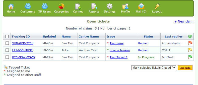
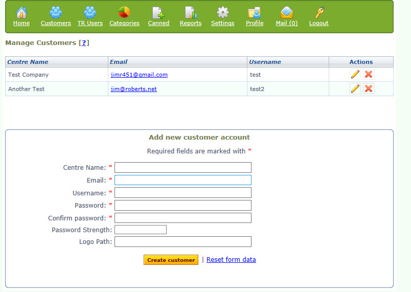
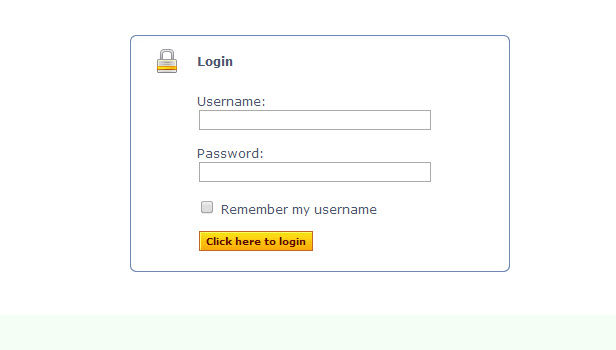
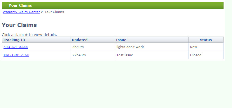
So what I did was create a new customers table in mysql, and created a new management script for the administrators.  On the front end, the customers must “login” first, then can open a new ticket, and see their old tickets.  Note this involved a fair amount of modification within the HESK php code, and some database modifications.  But it shows what is possible with the code available.  Some screenshots:

New "Customers" navigation icon up top

Creating a new customer record. The edit screen is similar

Customer login on the front end before seeing / creating a ticket.

The customer's list of tickets.

Comments Off on Adding customer login to HESK | HESK

Don’t make your users think…

March 17th, 2014 — 10:30am

I use netvibes.com as a dashboard for my web activities.  It’s pretty nice, and helps me keep organized.  However, last week I was confused when I tried to login to the site – The “Login” button / link was gone!  Here’s what I saw:

Wow – how was I supposed to “Login”?  It’s a core function required by existing customers.  It had to be there.

Well, after a few moments of puzzling, I figured out that the “Connect” button is really the new login button.  I guess the designers got a little cute here, thinking in social media terms (although, even there, “Connect”  is not the same as “Login).   But that is where I needed to go.

There are a few points I want to make here:

  1. Be very careful changing the language and location of critical functions on your site.  Your regular users are used to it and could be disoriented if you alter it.
  2. Don’t get cute with wording.  Use terms that everyone else is using.  So don’t use “Connect” when everyone else is using “Login”.  It may make sense to you, but you will lose / confuse your users for at least a while.

I’ve seen these mistakes a few times over the years with clients.  They think that varying the wording will make it “Stand out” more, or that it’s a better way to describe the function.  But most websites are about function first.  Design is important, but your users are coming to your site to accomplish a specific task – research, purchasing, etc.  Don’t let design get in the way of that.

There are many good books on website usability, but a classic (relatively easy read), is Steve Krug’s “Don’t Make Me Think”.  This is a good place to start, but you can glean a lot by just looking at the most successful sites on the web.

Comments Off on Don’t make your users think… | Usability

Lessons from Target’s massive security breach

January 30th, 2014 — 9:36am

Late last year, Target Corp. revealed a massive data breach of its systems, resulting in 70 million customer records being compromised.

Recently, they revealed that the hackers got in initially through credentials stolen from a Target vendor.  There are some lessons here for the small business owner, regarding security:

  1. Many successful data breaches are accomplished through “social engineering”.  This means using non-technical means to gather sensitive data or passwords.  For instance, calling technical support and impersonating the real account holder – convincing the rep to reveal information about the account.
  2. Your security is only as strong as its weakest link.  This may be your web software, your hosting provider’s security, employees, your smartphone, or the filing cabinet where you store customer information.
  3. You should monitor your security regularly to prevent breaches, or catch a problem early on.

Here are a few points for reviewing your data security:

  • Who has passwords to your website?  Any time an employee or consultant leaves your business, you should change passwords.
  • Where / how is sensitive data handled?  Do you clean out unnecessary information (like credit card info), etc.  on a regular basis?  Have you reviewed PCI guidelines if you are an online vendor?
  • Do you proactively update your web software to make sure any security issues are addressed?  Do you have someone who understands web security who can review your site occasionally?

A data breach can literally wipe out a small business.  Customers lose confidence in you, they may sue you, and your credit card company may cancel your merchant account.  So it’s important to pay attention to the threats out there, and be proactive about security.

Comments Off on Lessons from Target’s massive security breach | Security

Single solution for web analytics and monitoring

December 10th, 2013 — 9:04am

Many websites these days are using google analytics for tracking their web visitors.  While Google is the “king” of analytics, there are some drawbacks I have noticed.  For instance, there is so much data there, clients often have trouble analyzing and digesting it.  Also there are data / privacy issues – you are voluntarily giving your site data to Google, which has a financial stake in using that data (in some cases, to show your competitors’ ads to your visitors).  Also, google doesn’t offer any site monitoring / warnings when your site is down.

Enter clicky.com – this service has a free version, but the real power is in the pay services.  I stumbled upon this service while looking for a way to monitor client sites for “uptime” (make sure they are working), but was also getting requests for SEO / keyword analysis and related services.  This offers help on both counts, for a reasonable price.  I’ve been using this for about a month now, and here are the features I like best:

  1. Site monitoring – You can set up various services to monitor, and get emailed if there are any outages.  This can identify a slow hosting provider, or one that is down frequently.  If your site is down, that’s obviously something you need to know.
  2. Realtime – these stats update on the fly – so you can see what people are doing right now, and traffic to the site.
  3. Keywords / searches – See a quick report on how people are finding your site.  Also see where you rank for those keywords in various search engines.
  4. Goals / Events – get notified when someone performs a specific action on your site.  This can be a purchase, or just adding something to their cart.  I haven’t used these very much yet, but it’s easy to set up and get reports.
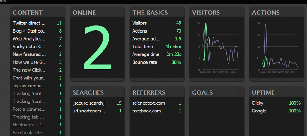
  5. Big Screen – if you have a spare monitor, or mobile device (it’s responsive design), the “Big Screen” view is pretty nice – providing realtime data for the site.  This is a cool way to keep tabs on your site’s health and vibrance – here’s a screenshot:
    Big screen analytics from Clicky

These are a few of the highlights of Clicky, but there are many more.   I plan to keep using this for my sites, and also for client sites.  I hope they keep expanding on the uptime monitoring, maybe adding “response time” and historical reports in that area.  Also, if they added a “chat” feature to engage with specific site visitors, that would be killer.  Overall, this is a great solution that combines many services into one spot.

Comments Off on Single solution for web analytics and monitoring | Web Tools

Back to top