Archive for March 2014


Adding customer login to HESK

March 21st, 2014 — 3:47pm

6/8/2016 Note: I’ve gotten some calls from people on this modification.  Due to the age of the post, and my current schedule, I’m unable to provide any consulting on modifying HESK.  The article here describes a general path to the modification, but most people would need to hire a programmer to get it completed and working.

HESK is a great (and low cost) php based helpdesk and knowledge base system.  It comes with full source code, so you can modify it to suit your needs.

I recently installed it for a client.  One major missing feature is that there is no “login” for customers.  Anyone can submit a ticket with just an email address.  This works well in many situations, but in this case, the client only wanted pre-approved customers using the system.

So what I did was create a new customers table in mysql, and created a new management script for the administrators.  On the front end, the customers must “login” first, then can open a new ticket, and see their old tickets.  Note this involved a fair amount of modification within the HESK php code, and some database modifications.  But it shows what is possible with the code available.  Some screenshots:

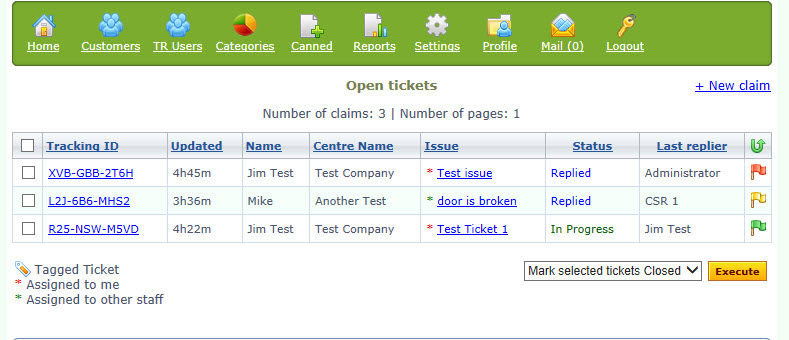
New "Customers" navigation icon up top

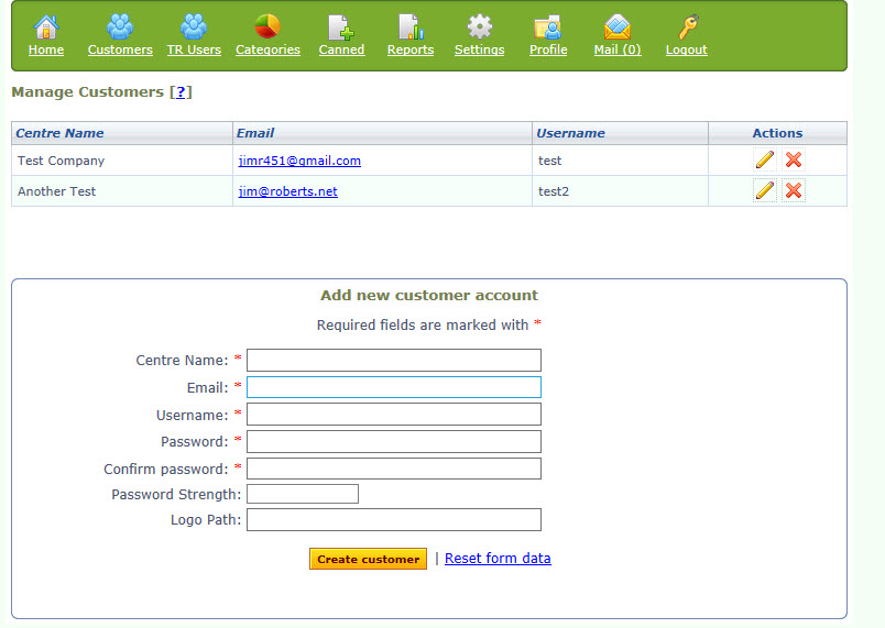
Creating a new customer record. The edit screen is similar

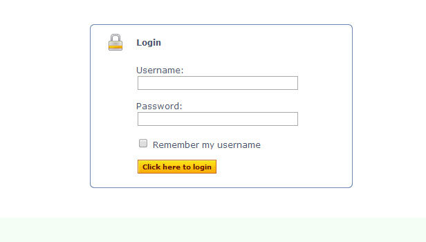
Customer login on the front end before seeing / creating a ticket.

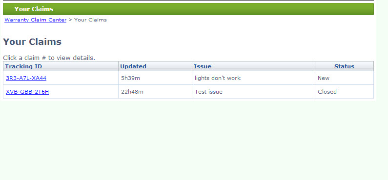
The customer's list of tickets.

Comments Off on Adding customer login to HESK | HESK

Don’t make your users think…

March 17th, 2014 — 10:30am

I use netvibes.com as a dashboard for my web activities.  It’s pretty nice, and helps me keep organized.  However, last week I was confused when I tried to login to the site – The “Login” button / link was gone!  Here’s what I saw:

Wow – how was I supposed to “Login”?  It’s a core function required by existing customers.  It had to be there.

Well, after a few moments of puzzling, I figured out that the “Connect” button is really the new login button.  I guess the designers got a little cute here, thinking in social media terms (although, even there, “Connect”  is not the same as “Login).   But that is where I needed to go.

There are a few points I want to make here:

  1. Be very careful changing the language and location of critical functions on your site.  Your regular users are used to it and could be disoriented if you alter it.
  2. Don’t get cute with wording.  Use terms that everyone else is using.  So don’t use “Connect” when everyone else is using “Login”.  It may make sense to you, but you will lose / confuse your users for at least a while.

I’ve seen these mistakes a few times over the years with clients.  They think that varying the wording will make it “Stand out” more, or that it’s a better way to describe the function.  But most websites are about function first.  Design is important, but your users are coming to your site to accomplish a specific task – research, purchasing, etc.  Don’t let design get in the way of that.

There are many good books on website usability, but a classic (relatively easy read), is Steve Krug’s “Don’t Make Me Think”.  This is a good place to start, but you can glean a lot by just looking at the most successful sites on the web.

Comments Off on Don’t make your users think… | Usability

Back to top